
When it comes to commercial painting, office paint colors are often overlooked. Yet, the colors on your walls can significantly influence mood, focus, creativity, and even stress levels. Whether you’re setting up a home office or revamping a corporate space, choosing the right office paint colors can be the difference between a dynamic, energized environment and a dull, uninspiring one.
In this guide, we’ll dive into the best office paint colors to choose and which ones to skip—because not every trendy shade is a good idea for productivity.
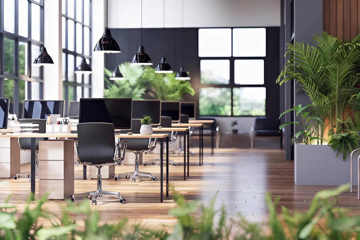
Why Office Paint Colors Matter More Than You Think
Before we get into what works and what doesn’t, let’s talk about why office paint colors are so important. Studies in color psychology show that certain hues can directly influence our mood and cognitive function. This isn’t just theory—corporate giants like Google and Facebook invest heavily in designing their workspaces around color psychology principles.
The right office paint colors can enhance focus, creativity, and even improve employee morale. On the flip side, the wrong shades can cause fatigue, distraction, or even increase stress levels. If you want your workspace to fuel productivity, creativity, and positivity, the colors on your walls are not just décor—they’re a strategy.
Office Paint Colors That Work
Choosing the right paint colors in commercial settings depends on the type of work environment you want to create. Different colors evoke different responses, so here’s a breakdown of colors that truly work for office spaces.
Blue: The Productivity Powerhouse
Blue is one of the most popular office paint colors—and for good reason. Known to boost focus and efficiency, blue tones are perfect for environments where deep concentration is required. Light blues promote calmness, while darker shades add depth and sophistication to a space. If you’re in a field that demands attention to detail—like accounting, writing, or legal work—blue is your best bet.
Green: The Balance Booster
Green symbolizes balance, harmony, and renewal, making it an excellent office paint color for reducing stress and promoting a sense of calm. It’s especially ideal for offices where employees work long hours since it’s easy on the eyes and promotes a sense of stability. Creative professionals or high-stress environments can benefit from green hues, especially softer tones like sage or mint.
Gray: Sleek and Modern
While gray may sound dull, when used correctly, it can offer a clean, professional, and modern look. It pairs well with brighter accent colors and is often used in minimalist office designs. Just be sure to stick with warmer gray tones to avoid a cold, sterile feeling. If you’re aiming for a sophisticated corporate aesthetic, gray is an excellent foundational office paint color.
White: Clean and Focused
White creates a sense of openness and clarity, making spaces feel larger and brighter. It’s a safe and versatile office paint color that works well for creative spaces where focus is essential. However, pure white can feel sterile or uninspiring if overused, so it’s best complemented with artwork, plants, or colorful accents.
Yellow: Energetic and Optimistic
If your office thrives on creativity and energy, yellow is a solid choice. It’s associated with happiness, optimism, and innovation. However, go for softer, muted yellows rather than bright, overwhelming shades to avoid overstimulation. This office paint color is great for creative agencies, marketing firms, or brainstorming rooms where energy and enthusiasm are key.
Office Paint Colors to Skip
Just as the right office paint colors can enhance productivity and focus, the wrong ones can lead to distraction, stress, or discomfort. Here are some shades you might want to avoid when painting your office.
Red: Too Intense for Focus
While red can evoke passion and energy, it’s often too intense for a workspace. Red is known to increase heart rate and blood pressure, which can cause anxiety in high-pressure environments. It may work in creative breakout areas or social spaces, but as a primary office paint color, it’s best skipped.
Black: Overly Heavy and Draining
Black can be sophisticated in moderation, but too much of it in an office environment can feel oppressive and draining. It can absorb light and make spaces feel smaller, which is not ideal for productivity. If you love darker shades, consider using black for accents rather than as the main color.
Bright Orange: Overstimulating and Distracting
While orange is associated with enthusiasm and energy, bright shades can be overstimulating, leading to restlessness and distraction. If you’re drawn to orange, use it sparingly—perhaps as an accent wall or in decorative elements rather than a primary office paint color.
Neon Colors: Visually Exhausting
Neon greens, pinks, and yellows might be trendy for fashion, but they’re a disaster for productivity. These colors are harsh on the eyes and can cause fatigue over time. Neon office paint colors should be avoided entirely if you’re aiming for a focused, professional atmosphere.
How to Choose the Right Office Paint Colors for Your Space
When selecting office paint colors, consider the nature of your work, the amount of natural light in the space, and the overall vibe you want to create. A creative agency might thrive with bold, energetic colors, while a law firm might lean toward muted, calming hues.
Another key factor is personal preference. While color psychology offers general guidelines, it’s important to choose office paint colors that feel right for you and your team. A color that’s calming to one person might be uninspiring to another, so don’t be afraid to test swatches and experiment with combinations.
Remember, it’s not just about what looks good—it’s about choosing shades that enhance your workflow, reflect your brand’s personality, and contribute to a positive, productive atmosphere. So, skip the colors that drain energy and focus on those that truly work for your space. Your walls might just become your secret productivity weapon.
Choose Pristine Painting & Coatings for Expert Commercial Painting Services in Honolulu, HI
Ready to transform your workspace with the perfect office paint colors? Trust Pristine Painting & Coatings, Honolulu’s go-to commercial painting experts. With years of experience delivering top-quality results for businesses, we understand how the right colors can boost productivity, enhance focus, and create a professional atmosphere that reflects your brand.
Don’t settle for anything less than pristine—contact us today to schedule a consultation and elevate your office space with colors that truly work!


